Sherwin Williams has long been a go-to brand for homeowners and designers alike, thanks to its vast array of color options. Among these, Accessible Beige stands out as a favorite choice. This warm neutral hue is more than just paint; it’s a versatile backdrop that can transform any space into a cozy haven.
Accessible Beige captures the essence of modern design while offering timeless appeal. Its soft undertones create a welcoming atmosphere, making it perfect for both contemporary and traditional homes. In this blog post, we’ll explore what makes Sherwin Williams Accessible Beige so popular and why it deserves a spot on your walls. Whether you’re looking to refresh your living room or revamp an entire home, you’ll want to learn more about this captivating shade.
The Color Psychology Behind Accessible Beige
Color psychology plays a significant role in how we perceive and interact with our surroundings. Accessible Beige, with its warm undertones, creates an inviting atmosphere that encourages relaxation.
This soft neutral hue embodies balance and harmony. It promotes feelings of comfort, making it perfect for living spaces where family gathers or friends come to visit.
Unlike cooler shades, Accessible Beige has a gentle warmth that can make any room feel cozy. Whether it’s in the kitchen or bedroom, this color helps foster connections among loved ones.
Moreover, beige is known to evoke a sense of stability. This grounding quality appeals to many homeowners looking for a serene environment amidst busy lives.
When paired with natural light, Accessible Beige reveals its true beauty—subtle yet impactful. Its versatility allows it to complement various decor styles while maintaining an effortlessly chic vibe throughout your home.
How to Incorporate Accessible Beige in Your Home Decor
Accessible Beige offers a versatile backdrop for various decor styles. Start by painting your living room walls with this warm hue to create a cozy atmosphere. Pair it with white trim for a classic contrast.
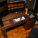
Furniture presents another opportunity to showcase Accessible Beige. Consider upholstered pieces in this shade, which can complement earthy tones and natural textures like wood or rattan.
In the kitchen, use it as cabinet paint to add warmth without overwhelming the space. Accent it with vibrant accessories like colorful dishware or artwork that pops against the neutral base.
Don’t forget about textiles! Throw pillows and rugs in complementary colors can enhance your design while maintaining a harmonious look.
Lighting plays an essential role; soft fixtures can bring out its inviting qualities, making any room feel more welcoming and comfortable.
Other Popular Sherwin Williams Paint Colors
Sherwin Williams offers a diverse palette that caters to various aesthetics and styles. Among the favorites, “Repose Gray” stands out with its subtle warmth and versatility. It’s an ideal backdrop for both modern and traditional spaces.
Another crowd-pleaser is “Alabaster,” a soft white that brings lightness without feeling stark. This creamy hue works wonders in kitchens and bathrooms, creating an inviting atmosphere.
For those seeking bold options, “Naval” commands attention with its deep navy tone. Perfect for accent walls or cabinetry, it adds drama while remaining sophisticated.
Then there’s “Mindful Gray,” which strikes the perfect balance between warm and cool tones. It’s versatile enough to pair well with countless other colors, making it a favorite among designers.
Lastly, “Sea Salt” introduces a refreshing coastal vibe with hints of green-blue undertones—ideal for serene living spaces or beach-inspired designs.
Tips for Choosing the Right Paint Color
Choosing the right paint color can feel overwhelming. Start by considering the mood you want to create in a room. Warm colors like reds and yellows evoke energy, while cooler tones promote calmness.
Look at your space’s natural light throughout the day. Colors may appear differently based on how much sunlight enters the room. Test samples on multiple walls for accurate representation.
Consider existing furniture and decor elements too. A cohesive look ties everything together seamlessly.
Don’t shy away from experimenting with accent walls or different finishes, such as matte versus glossy, to add depth and interest.
Trust your instincts. If a shade makes you smile or feels comforting, it’s likely the right choice for you!
Pros and Cons of Using Accessible Beige
Accessible Beige comes with several advantages. Its versatility allows it to complement a wide range of decor styles, from modern to traditional. This neutral hue creates a warm and inviting atmosphere, making spaces feel cozy yet spacious.
On the flip side, some might find Accessible Beige too subtle or bland. In brightly lit rooms, it may appear lighter than expected, which could alter your design vision.
The undertones can also be tricky; depending on lighting conditions, they might shift toward gray or yellow.
Maintenance is another factor to consider—light colors often show dirt and scuffs more easily than darker shades. It’s essential to weigh these pros and cons against your specific needs before committing to this popular choice in home design.
Conclusion: Why Accessible Beige is a Top Choice for Interior Designers and Homeowners Alike
Accessible Beige stands out in the realm of interior design for several compelling reasons. First and foremost, its versatile nature makes it an ideal backdrop for various styles, from modern to traditional. This neutral hue complements a wide range of furniture and decor choices, allowing homeowners to express their personalities while maintaining a cohesive look.
Another key factor contributing to its popularity is its ability to adapt based on lighting conditions. Whether basking in natural sunlight or illuminated by warm incandescent bulbs, Accessible Beige reflects light beautifully without becoming overpowering. This adaptability ensures that spaces feel inviting at any time of day.
Interior designers frequently recommend Accessible Beige due to its timeless quality. Unlike trendy colors that may quickly fall out of favor, this shade remains relevant across different seasons and styles. It creates calm environments where people can relax and enjoy their surroundings.
Homeowners appreciate how effortlessly Accessible Beige integrates into existing color schemes. Pair it with whites for a fresh look or combine it with deeper tones for added drama—its flexibility knows no bounds.
Sherwin Williams Accessible Beige has earned its place as a top choice among both professionals and DIY enthusiasts alike because of these attributes. Its perfect balance between warmth and neutrality provides endless opportunities for creativity while ensuring comfort in every space it graces.